
Are You Making These Mistakes On Your Blogging Website?
If you’re pouring countless hours into your blog but aren’t seeing the results you hoped for, you might unknowingly be making some common blogging mistakes. The good news? These issues are often easy to fix and can completely transform your blog’s user experience, traffic, and engagement.
Below, I highlight 20 of the most common blogging mistakes (including web design mistakes and content & strategy errors to avoid) and provide practical solutions to help fine-tune your blog into an irresistible content hub that won’t scare visitors away.
These are things I’ve picked up over 10 years of blogging that I still see newbie bloggers making today. And hey, I’m still guilty of some. In fact, I’ve learned most of these the hard way.
So don’t be discouraged if you find yourself making some of these mistakes – just use them as opportunities to grow and evolve your blog. Let’s get into it!
This post contains affiliate links. This simply means that if you make a purchase following one of these links, I earn a small commission at no additional cost to you.
20 Common But Deadly Blogging, Web Design, SEO, Content & Marketing Mistakes
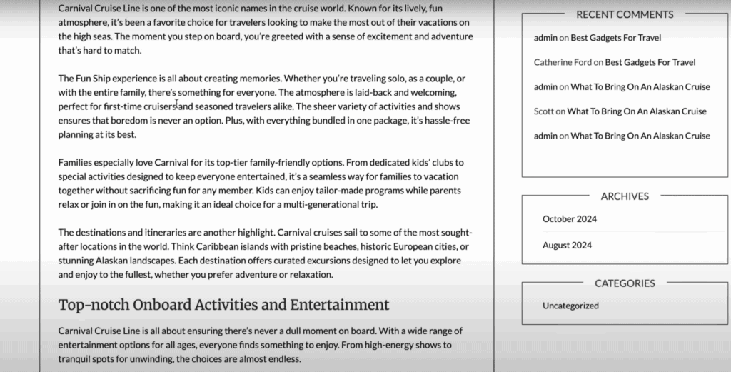
1. Displaying the Entire Article on the Homepage
The Mistake: Showing full-length blog posts on the homepage or category pages.
Displaying the entire article on your homepage can overwhelm visitors with too much information at once. Instead of enticing readers to click through and explore your content, it can make your homepage cluttered and chaotic.
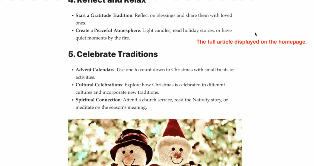
Additionally, loading full articles on the homepage can slow down your site, negatively affecting user experience and SEO performance. Search engines prefer faster-loading pages, and visitors may leave if they have to wait too long, increasing your bounce rate.
If the full article is displayed on your homepage or your category pages, this could also trigger Google to think your website is displaying duplicate content, which could affect your Google ratings.
How to Recognize It: Visit your homepage and scroll through it—are full blog posts taking up the majority of the space? Are visitors unlikely to see or click on other content because it’s all buried under lengthy articles? If so, this mistake could be holding your blog back. Look at your analytics to check for high bounce rates on your homepage. This could indicate your design isn’t encouraging readers to engage with your content further.
Why It’s a Problem: Makes it hard for visitors to browse your content, reduces click-through rates, and causes Google to flag duplicate content.
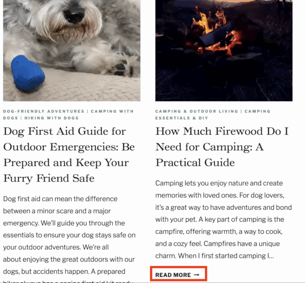
The Fix: Adjust your website or WordPress settings to display snippets (also known as post excerpts) or activate a manual “Read More” tag after the second paragraph of each post.
For most WordPress sites, there is a universal and fast fix – go to Settings > Reading > and select “Excerpt” from the “For each post in a feed, include” selection (making sure “Full text” isn’t selected).
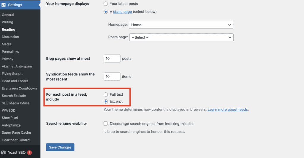
Saving this choice will automatically ensure only a snippet of your post is included in your homepage and category pages, therefore fixing this issue.
If this fix doesn’t work for you, you either need to add a “Read More” tag manually in each blog post or get a blog theme that has that function automatically.
At the end of the day, your theme determines how your content is displayed. If WordPress settings can’t override it, consider getting a new blog theme that is more functional. The best blogging themes with that functionality can be found on Theme Forest.
2. Using a Poorly Designed Web Theme
The Mistake: Poorly designed web themes with overlapping elements or non-functional features. An unfriendly or outdated web theme can significantly impact the user experience on your site. These themes often come with design flaws such as hard-to-read fonts, clunky navigation menus, or improper spacing that makes content appear jumbled.
Additionally, outdated themes may not be optimized for mobile devices, leading to a poor experience for mobile users, who often make up a large portion of your audience.
An easy way to spot if your theme is not up to standards is if you have overlapping elements or features that simply don’t work.
Functional issues, like buttons not working or slow loading times, can further frustrate visitors and drive them away. But beyond usability, such themes may lack support for modern web standards, which could make your site vulnerable to security risks and incompatible with newer plugins or upgrades.
Why it’s a Problem: Having a poorly designed or outdated theme can have a negative impact on your website’s user experience, functionality, and security. Not only will it discourage visitors from engaging with your content, but it could also leave your site vulnerable to cyber attacks and limit its potential for growth.
How to Fix It: The first step in fixing this issue is identifying the problem. Take some time to thoroughly test your website’s design and functionality from different devices and browsers. If you notice any issues or inconsistencies, consider switching to a more modern and well-supported theme.
There are plenty of free and paid themes available online that offer great design, compatibility with modern web standards, and regular updates for security patches. If stuck, consider hiring a professional via Fiverr to address specific design issues.
Potential solutions:
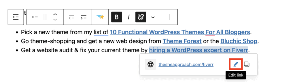
- Pick a new theme from my list of 10 Functional WordPress Themes For All Bloggers.
- Go theme-shopping and get a new web design from Theme Forest or the Bluchic Shop.
- Get a website audit & fix your current theme by hiring a WordPress expert on Fiverr.
3. Outbound Links Open in the Same Tab
The Mistake: Having external links take users away from your blog without allowing them to return easily.
Links, by nature, can be outbound links (when you link to sources outside of your domain or website) or inbound (when you link to other pages or posts that can be found on the same website).
As a rule of thumb, outbound links should always be opened in a new tab!
Why It’s a Problem: Can lead to lost traffic and less time spent on your site.
When outbound links open in the same tab, users are taken away from your site entirely in just one click. This disrupts their browsing experience and increases the likelihood that they won’t return.
For example, a user clicking on an external link might get distracted by the new page, closing your site or forgetting they were even there. This can negatively impact key metrics such as session duration and bounce rate, which are both critical indicators of user engagement. (In simple terms, it has a negative impact on your SEO as Google looks at how users interact with your website and how fast they leave.)
Additionally, it disrupts your content’s flow and can hinder the user’s ability to fully engage with your content or other valuable resources or calls-to-action you’ve provided.
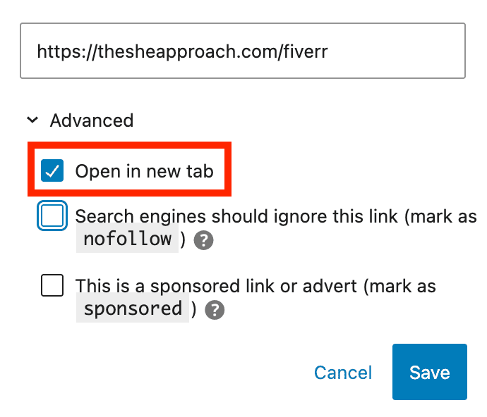
The Fix: Configure all outbound links to open in a new tab. Only keep inbound links at the very end of your articles, posts or pages that open in the same tab.
Whatever blogging or website-building platform you use, this option is available for every link you insert. In WordPress, you can easily do this by selecting the “Open in a new tab” option under the link settings.
If you are using affiliate or sponsored links, these also need to be marked as such. Read my article on Follow VS No Follow Links Explained for more information.
4. Not Having An Email List
The Mistake: Relying solely on website traffic or social media without capturing visitor emails.
Relying only on social media follows and missing out on capturing visitor emails is a critical oversight for bloggers. Social media platforms, while powerful, are not fully within your control.
Algorithms frequently change, and platforms can limit your content’s reach, making it harder to consistently connect with your audience. Additionally, accounts can be suspended or removed without warning, leaving you with no direct line to your followers.
By building an email list, you establish a reliable channel to communicate with your audience, share updates, and drive traffic back to your website—independent of third-party platforms. An email list ensures you have direct access to your readers, fostering deeper engagement and building a loyal community.
Why It’s a Problem: You miss an opportunity to establish a personal connection with your audience.
Without a direct way to reach your audience, you are unable to effectively promote your own products or offers, leaving potential sales untapped. This lack of communication not only impacts your ability to share exclusive deals or updates but can also lead to a significant loss of income over time, as you’re unable to nurture and monetize your audience effectively.
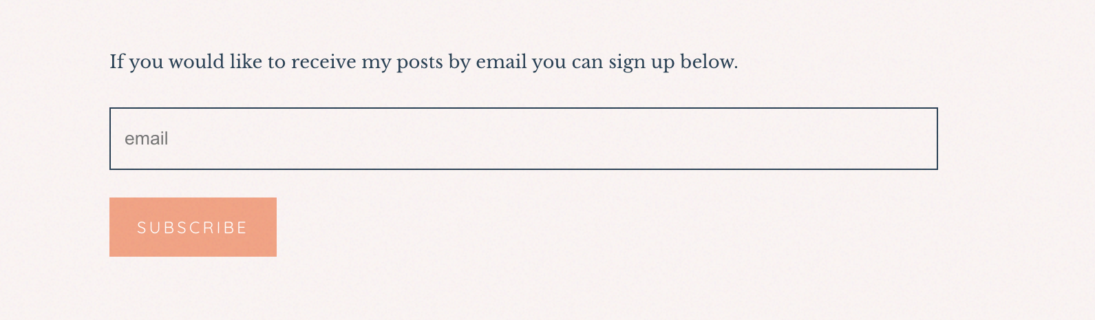
Keep in mind that having a “Subscribe for updates” form on your website isn’t enough either! You need to entice your blog readers and website visitors to sign up to your email list by offering something in exchange.
The Fix: Set up an email list with lead magnets like freebies, guides, or checklists to encourage sign-ups.
Ideally, you will want to segment your list to keep track of what freebies or offers people signed up for, so you can send them related emails in the future. Use the segments and tags provided by your email provider to do that early on!
More email marketing resources:
- Start an email list for free with Mailerlite (you get 1,000 free subscribers)!
- Read about Why Bloggers Need An Email List
- Check out the ultimate guide on How To Start, Manage And Grow An Email List
- Consider your options: The Best Email Marketing Providers for Bloggers
5. No Footer or Call-to-Action at the End of Posts
The Mistake: Neglecting to include a footer or a “next step” at the bottom of pages or blog posts.
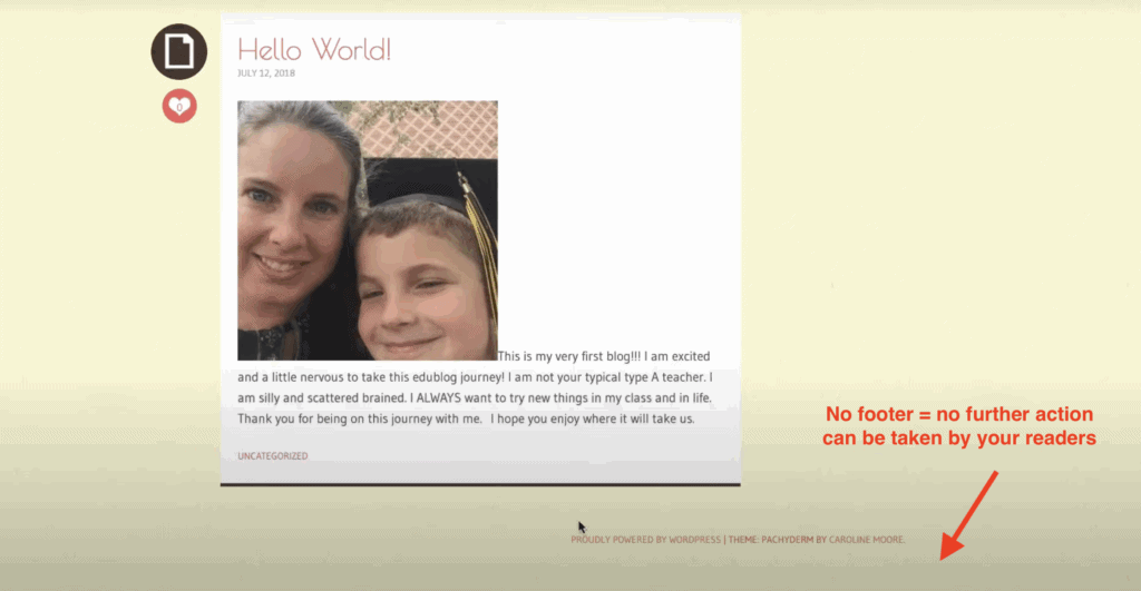
A website footer is a section that appears at the bottom of every page on your website. It typically includes information such as contact details, social media links, and other useful navigation links for your website.
These footers often include an intentional call to action or newsletter form, which offer your visitors one last chance and encouragement to take a desired action.
Neglecting to include these elements in your posts can be a missed opportunity to engage with your audience and potentially convert them into customers. Without clear next steps, visitors may simply leave your site without further engagement.
Why It’s a Problem: It leaves readers with nothing to do but exit your site.
The Fix: Make sure each post has a footer with relevant information and a strong call-to-action.

Include relevant information such as social media links, contact details, and links to intentional resources, blog categories, paid products or email sign-ups (depending on your goal and desired action).
Most web themes have a footer option that can be constructed in your Widgets page in “Appearance“. If that isn’t an option that comes with your theme, you can find a free Footer plugin, or add a call to action manually at the end of each page/post.
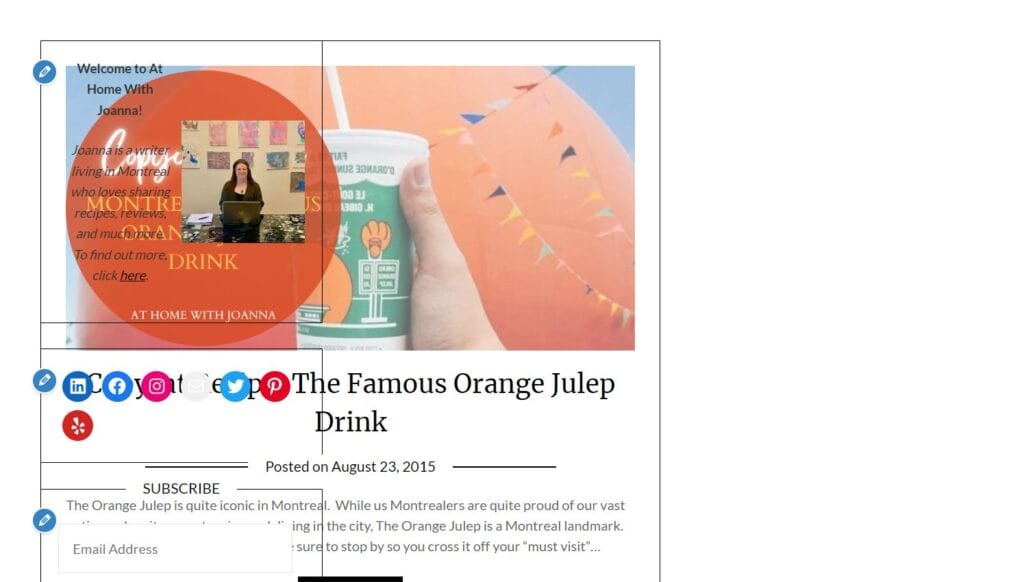
6. Poorly Sized or Displayed Images
The Mistake: Blurry, oversized, or proportionally incorrect images disrupt your website layout.
Poorly sized or awkwardly cropped images can make your website look unprofessional and difficult to navigate. You have to work with your website layout when picking images to display – especially in places like the homepage or high-traffic pages.
Otherwise you will be left with sections of your website where your head is cut off, like in the example below, or when the poor quality of the image shows when you try to upload it as a banner.

Why It’s a Problem: It looks unprofessional and reduces trust.
If your visitors can’t trust you to display your images correctly, they probably won’t trust your content & written recommendations either.
The Fix: Take the time to properly resize, crop, and optimize your images before uploading them to your website.
Make sure to save images in a web-friendly format such as JPEG or PNG, and compress them if necessary to reduce file size without sacrificing quality.
Use an image editing software or online tool – like Short Pixel – to adjust dimensions and proportions accordingly. Also, consider using a responsive design theme that automatically adjusts images for different screen sizes.
And always preview your website live, on multiple devices, to ensure images are displayed correctly. If all else fails, pick better photos!
READ NEXT: Where To Find FREE Stock Photos Online
7. Not Enough Spacing Between Design Elements
The Mistake: Squashed paragraphs, images, and headers with no white space.
A cluttered website is often unappealing and overwhelming for visitors. It can make it difficult for users to read and digest information, leading them to quickly leave your site.
It’s like trying to shop in a store that squishes all their products into one row, without spacing out the different brands. It’s hard to find what you’re looking for, and it’s not a pleasant experience.
Why It’s a Problem: Makes posts hard to read and visually overwhelming.
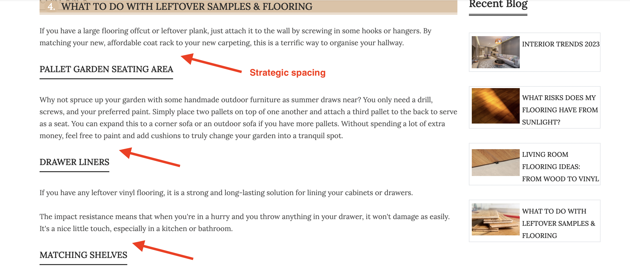
The Fix: Create enough space between design elements so that the information can be easily read and understood.
Adding white space can help break up the text and guide users through your website in a more organized manner. White space also draws attention to important elements on your site, making them stand out. Use margins, padding, line spacing, and proper paragraph length to create a balanced layout. Minimalist design is often more effective than cramming too much information onto one page.
In addition to adding white space within your website design, consider using visual hierarchy when organizing content (for example, using the correct H2, H3 headers, adding bullet points and so on).
My PRO tip is to use the “spacers” block in WordPress to add 20–30 pixels of white space at the end of each section for a more breathable design.
8. Using a Black or Dark Background
The Mistake: Using a black or dark background color on your website.
Have you ever noticed that 98% of all websites that exist have a white or very light background? That’s not a coincidence. A simple and light background color makes all your other elements stand out and it gives your website an implicit impression of professionalism.
When you use a pitch black background, or even darker colors such as dark grey, you are making it difficult for your users to read the content on your website. Text needs to be easily readable and bright white text on a black background just doesn’t work as well.
Why It’s a Problem: It’s visually unappealing and harder to read.
The Fix: Stick to white or neutral-colored backgrounds for a clean, professional look.
White backgrounds provide contrast which makes text easier to read. It also gives you the freedom in choosing colours for your other elements such as titles, images, videos, and buttons without worrying about them blending into the background.
9. Light or Unreadable Text Colors
The Mistake: Using very light or pale colors for text or links.
Sometimes, websites or brands with a more neutral color scheme, make the mistake of using those natural or very light colors as the font color for their text or links. You’ll see why it’s an issue below.
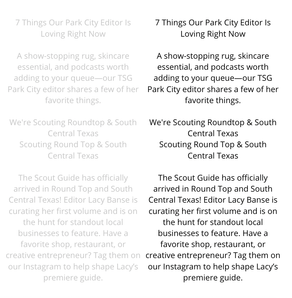
Why It’s a Problem: It reduces readability and deters users from clicking links or reading your content.
Your font colour matters – and if your text can’t be read without considerable effort from your reader’s part, they probably aren’t going to bother. Light font for links also results in fewer clicks which can affect your click-through rate for affiliate links, or other important outbound links.
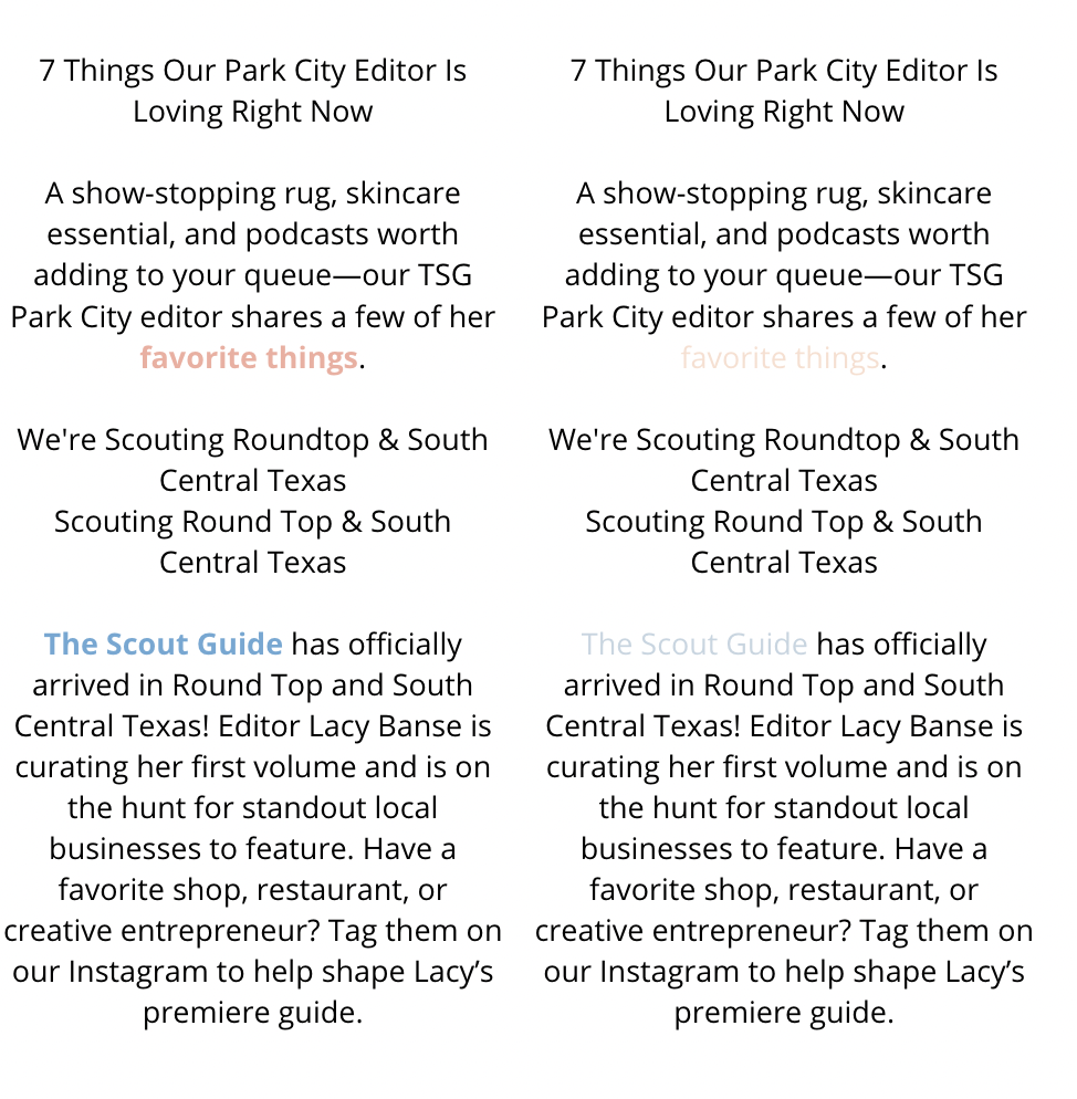
The Fix: Ensure high-contrast text (e.g., dark grey for text, dark blue for links) on neutral backgrounds for better visibility.
If your font used for links is lighter, you can bold the text that you are anchoring a link to (like in the example above), to ensure it’s more visible. If that isn’t enough (and make sure you check it on smaller screens as well), choose a font color a couple of shades darker.
10. No SSL Certificate
The Mistake: Your site shows as “Not Secure” or runs on HTTP instead of HTTPS.
When you have a “Not Secure” warning displayed in a browser open tab, your visitors are immediately on alert. This issue is especially alarming if your website involves sensitive transactions, such as handling personal information, passwords, or credit card details. Even if your site doesn’t deal with sensitive data, visitors may hesitate to browse or interact with it, fearing their information may be at risk.
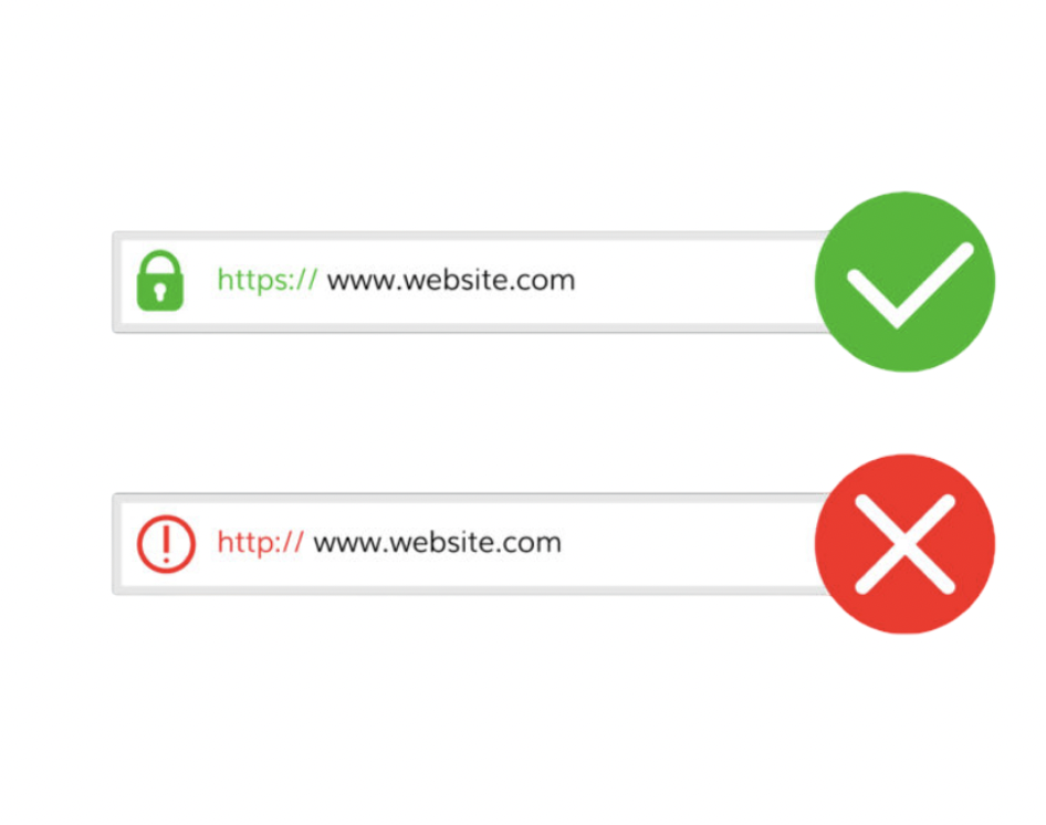
Why It’s a Problem: Visitors may distrust your site, especially if they need to make a transaction.
An SSL certificate ensures that the data being transmitted between your visitors and your website is encrypted and secure. When your site uses HTTPS (instead of HTTP), it signals to browsers and users that your site can be trusted. A website that is flagged as “Not Secure” may also suffer from poor search engine rankings, as site security is a ranking factor for platforms like Google. This not only impacts trust but also your website’s visibility.
The Fix: Contact your host to set up an SSL certificate – most of the time it’s included for free.
The good news is that setting up an SSL certificate is often a straightforward process. Many hosting providers offer free SSL certificates (such as those provided by Let’s Encrypt) and can guide you through the setup.
Start by reaching out to your hosting provider and checking if free SSL certificates are included in your hosting plan. If they are not, consider switching to another host that prioritizes security—think of it as an essential investment in your site’s credibility and functionality. Once set up, you’ll see the reassuring padlock icon in the browser next to your URL, instantly showing visitors your site is safe to use.
Hosting providers that offer a free SSL certificate and a free set up for it as well are Bluehost, Hostinger & BigScoots.
11. Oversized Header Images

The Mistake: Using a massive header image or logo that dominates the entire above-the-fold area of your website.
Why It’s a Problem: While a visually striking header can initially grab attention, an oversized header image or logo often does more harm than good. It consumes valuable screen real estate, especially on smaller devices.
This means that visitors must scroll before they can access key content, such as your navigation menu, call-to-action buttons, or introductory text. For many users, this extra step can be frustrating and may even encourage them to leave your site before exploring further. Additionally, large headers can slow down page load times, negatively impacting the user experience and potentially reducing your site’s SEO ranking.
The Fix: Aim for balance when designing header elements. Your header should be visually appealing, but also functional and space-efficient. Resize header images and logos to ensure they don’t take up more than a small portion of the screen, particularly on mobile devices.
A longer horizontal banner image is preferable as a header instead of a tall vertical image, as it takes less precious space, and doesn’t require scrolling to see the next sections of the website.
Alternatively, consider utilizing a smaller logo paired with a compelling tagline or key navigation options to immediately engage visitors without distracting them from the content that matters most. Remember, the goal is to quickly provide users with enough information to guide them further into your site and encourage interaction.
12. Lack of Formatting in Blog Posts
The Mistake: Many blogs feature long, unbroken blocks of text without any formatting. This makes the content visually overwhelming and difficult to digest.
Why It’s a Problem: Readers are likely to skim your posts rather than read every word. If your content appears dense or uninviting, readers may lose interest or leave your site before engaging further. Poor formatting reduces the overall readability and makes it harder for key points to stand out. Not to mention that it shows a lack of creativity. Your blog isn’t a paperback book – you can jazz it up!
The Fix: Break up your text with thoughtful formatting to enhance the reader’s experience. Use headers to organize sections clearly, bullet points or numbered lists for easy skimming, and include relevant visuals like images, charts, or infographics to add visual interest.
Keep paragraphs concise and use white space strategically to create breathing room, ensuring your audience stays engaged and can quickly grasp the information they need.
13. Small or Hard-to-Read Font Size
The Mistake: Fonts are too small or improperly configured, making it difficult for readers to comfortably consume your content.
Why It’s a Problem: When the font size is too small, it strains the reader’s eyes, especially on smaller screens like mobile devices. This not only makes your content less accessible to a wider audience—including individuals with visual impairments—but also increases bounce rates as some readers may leave instead of struggling to read.
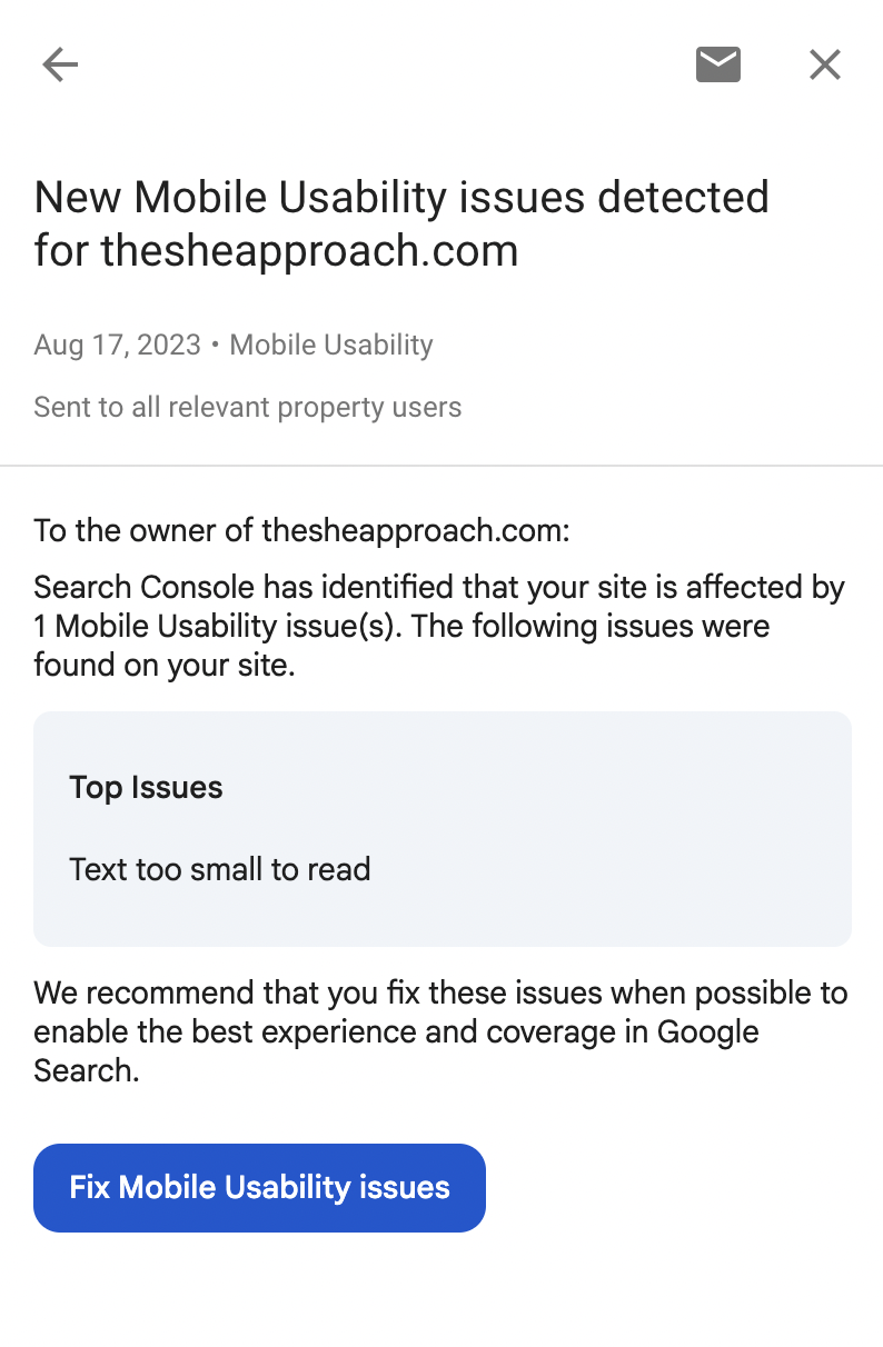
If your font is hard to read, you risk losing your audience’s attention, as they are less likely to engage with text that feels like a chore to decipher. This also gets flagged by Google’s search engine and can affect your standings in the search results. If you have the Google Search Console set up for your blog, you will receive alerts in there if you have pages where this issue gets flagged:
The Fix: A good starting point is to use font sizes that are appropriate for your audience and easy to see across all devices. For most body text, a size of at least 14-16px is recommended, as it is considered the minimum for readability on screens. Headings and subheadings should be larger and consistent in their hierarchy to provide visual clarity.
Ensure that font styles are also plain and clean—avoid overusing decorative or cursive fonts that may look appealing but dramatically reduce readability.
Test your font choices on multiple devices and resolutions to confirm consistency. Additionally, adhere to accessibility guidelines, such as WCAG (Web Content Accessibility Guidelines) standards, to ensure your content meets the needs of users with varied visual abilities. By prioritizing readable and well-sized fonts, you can make your content accessible, more engaging, and enjoyable to read for everyone.
14. Not Fixing Broken Links
The Mistake: Having links that direct users to dead ends, missing pages or incorrect destinations.
Why It’s a Problem: Broken links not only disrupt the user experience but can also damage your credibility and professionalism. Users may encounter 404 error pages, links that lead to websites that no longer exist, or affiliate links that fail to track properly. Additionally, links with spelling errors or incorrect formatting can leave users frustrated and hinder their ability to access important content or services.

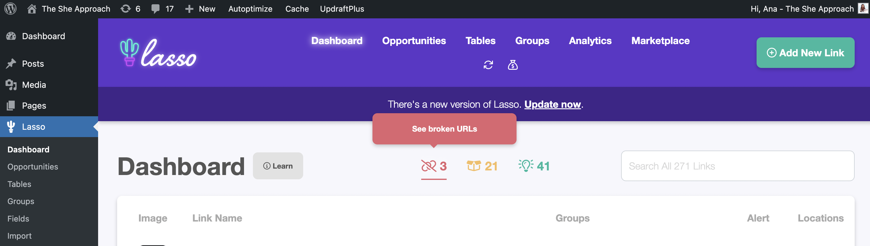
The Fix: To avoid broken links, establish a routine process for checking and updating all links on your website. Utilize tools such as link checkers to identify non-functional or outdated URLs efficiently. For example, you can request a website audit from SemRush that will identify any currently used broken links on your website.
For affiliate links, ensure they are correctly formatted and up to date to avoid losing potential revenue, and that they don’t link to out-of-stock items. I use the Lasso affiliate plugin for that, which alerts you of broken links and out-of-stock items (and it tells you how many days they have been out of stock for, so you can decide if it’s worth replacing that link)!
Furthermore, always double-check the spelling and accuracy of your links before publishing, and periodically review older content to verify whether linked websites are still active. Taking these steps will significantly improve user satisfaction and maintain your site’s credibility.
15. No Navigation Menu
The Mistake: Some websites overlook including a functional navigation menu or a search bar, leaving visitors without an easy way to explore the content available.
Why It’s a Problem: When users can’t find what they’re looking for quickly, they’re more likely to become frustrated and leave the site. This lack of easy navigation decreases user engagement and increases bounce rates, which can hurt your site’s overall performance. A well-structured site should feel intuitive, guiding visitors to the information they need without unnecessary hassle.
The Fix: Implement a clear and functional menu that organizes your site’s content effectively. Make sure to include main category links and subcategories where necessary to help users drill down into specific topics. Additionally, adding a search bar is a small but highly impactful improvement. This allows users to quickly locate exact information by typing in keywords, making their overall experience smoother and more enjoyable. Regularly test your site’s navigation to ensure that all links work properly and that the menu adapts well to different devices and screen sizes. A thoughtful navigation system keeps visitors on your site longer and fosters a positive impression.
16. Displaying Ads Too Soon
The Mistake: Overloading your blog with intrusive ads early on.
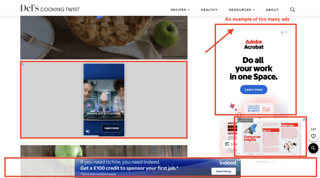
Why It’s a Problem: Jumping into ads too soon can backfire in several ways. Firstly, with low traffic, the revenue generated will likely be negligible, making the effort hardly worth it. More importantly, an abundance of ads creates a poor user experience, causing frustration or even driving visitors away. A cluttered, ad-heavy blog undermines the trust and credibility you are trying to build with your audience.
The Fix: Be patient and strategic when it comes to monetizing through ads. Focus on growing your traffic first by consistently delivering valuable content to your audience.
Once you’ve hit a steady threshold of at least 10,000–15,000 monthly page views, you’ll be in a better position to monetize effectively. At that point, apply for reputable ad networks like She Media or Mediavine, which prioritize quality and won’t overwhelm your site with intrusive ad placements.
Starting small, with carefully placed ads, ensures a balance between user experience and earning potential while maintaining your audience’s trust.
17. Not Monetizing Your Blog
The Mistake: Sharing valuable content without taking steps to monetize your efforts. While it’s a good idea to avoid overloading your blog with ads right away, skipping monetization entirely is an even bigger mistake.
READ NEXT: How To Make Money Blogging – The Ultimate Guide
Why It’s a Problem: You dedicate time and effort to creating content, engaging with your audience, and growing your blog. By not monetizing, you’re leaving potential earnings on the table and missing the chance to turn your passion into a sustainable source of income. Additionally, waiting too long to explore monetization strategies can make it harder to implement them down the line without disrupting your existing audience or content flow.
The Fix: Strike a balance by introducing monetization thoughtfully. Start with methods that align with your content and audience, such as Amazon affiliate links (or affiliate links for other brands and programs), which offer minimal disruption to the user experience.
Over time, consider diversifying your revenue streams through options like selling e-books, sponsored posts, creating planners or a curated selection of ads that don’t detract from your readers’ focus. There are so many ways to monetize that serve your readers further, instead of just plastering your content with ads – you just have to find what works for you!
18. Neglecting Your Blog’s SEO
The Mistake: You’re not paying attention to search engine optimization (SEO), or you’re using outdated SEO practices.
Why It’s a Problem: Without SEO, your blog’s visibility in search engine results suffers, making it difficult for new readers to discover your content. Poor SEO also reduces traffic and hinders your ability to build a loyal audience or monetize effectively.
The Fix: Stay up to date with modern SEO best practices such as keyword research, optimizing meta titles and descriptions, internal linking, and focusing on user experience. Use tools like Google Analytics & KeySearch for keyword research to track your SEO performance and identify areas for improvement. Don’t forget to prioritize quality content that provides real value to your readers—search engines reward content that genuinely meets users’ needs.
Keep in mind that a lot of the technical mistakes listed in this article also adversely affect your off-page SEO – aka your website’s standings with Google and other search engines. Fixing those should be the main priority when you start focusing on your website’s SEO.
But it has to be followed with good SEO practices for your content – this includes picking articles to write about topics that you’ve researched first, and found easy to rank for keywords for, and implementing them in your blog posts strategically.
Want to write high-quality content fast? Learn how to produce an entire year's worth of blog posts in just 30 days with my proven system for bloggers.
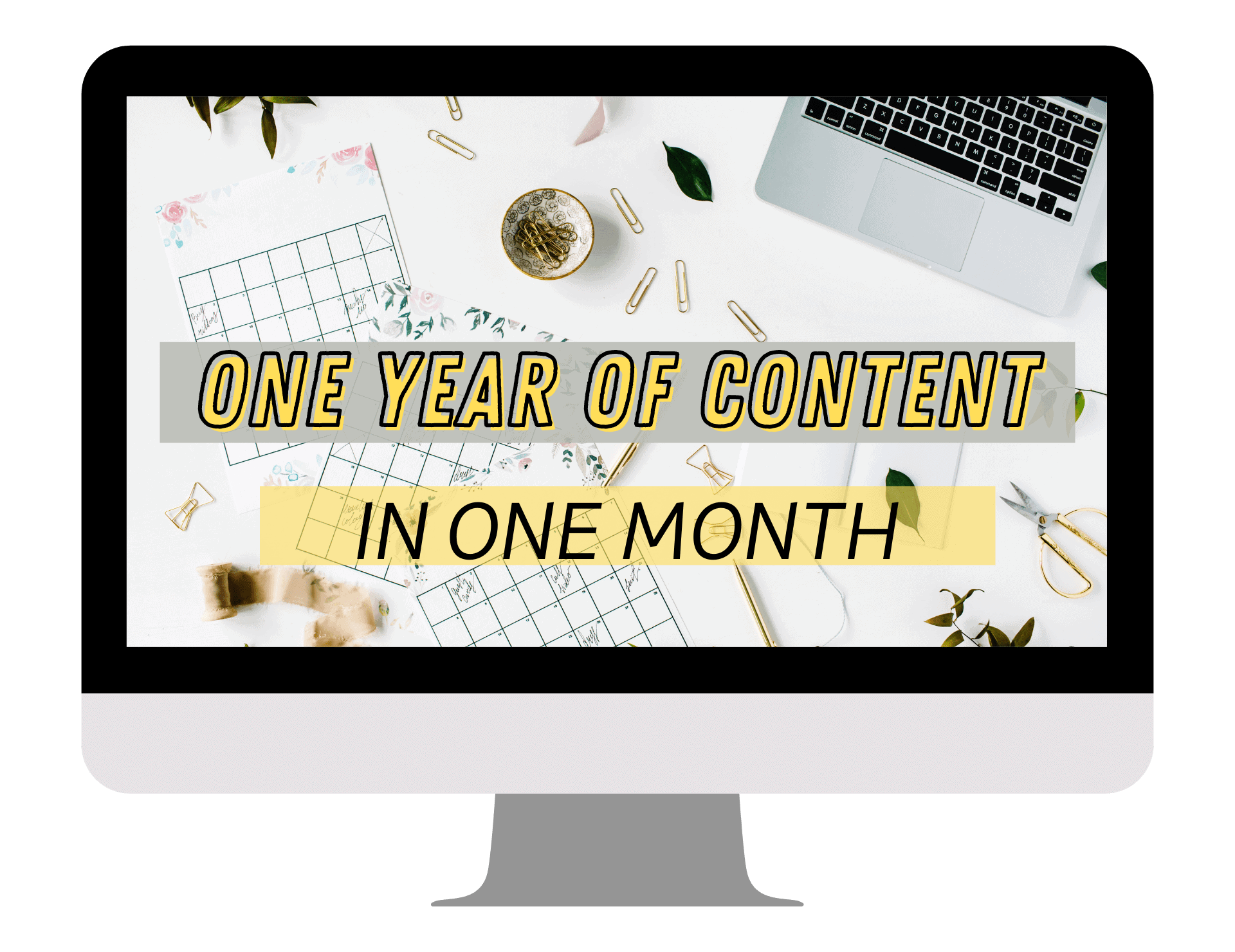
And this is exactly what I teach in my blog post SEO course! Go from ideas to fully written and researched articles for the entire year in just 30 days by following my proven formula.
19. Lack of Consistent Branding
The Mistake: Your blog doesn’t reflect a coherent brand identity.
Branding is more than just a logo or a color scheme—it’s about creating a unified experience for your audience. When your blog lacks a cohesive look and feel, visitors may struggle to connect with your content on a deeper level or recognize your input online. This can result in your blog becoming less memorable and harder to distinguish from others in your niche.
Why It’s a Problem: It makes your blog feel unprofessional or forgettable.
When your branding is inconsistent or poorly executed, it can detract from the credibility of your blog. Readers are more likely to trust content from a source that feels polished and professional. For example, if your website design changes dramatically from page to page, or if your messaging and tone appear scattered, it can leave visitors feeling confused or disengaged. A lack of cohesive branding signals that you might not have a clear vision for your blog, which can ultimately hurt your ability to grow and retain a loyal audience.
The Fix: Use consistent colors, fonts, and graphics to establish strong branding.
To build a recognizable and professional brand, start by defining your core elements. Choose a palette of complementary colors that reflect the mood or theme of your blog, and use them consistently across every page, social media post, and email. Pick one or two fonts that complement each other and stick with these in all your visuals and written content. Logos, icons, and graphics should align with your brand’s aesthetic to reinforce a smooth, unified identity.
20. Not Starting a Blog at All
The Mistake: Waiting or hesitating to start your blogging journey.
Why It’s a Problem: You lose out on opportunities to grow, connect, and monetize.
The Fix: Start today! Sign up for hosting and take the leap to create your blog.
Above All, the Biggest Mistake Is Not Starting
It’s natural to feel overwhelmed by the idea of starting a blog—what if it’s not perfect? What if no one reads it? What if you don’t know enough or make mistakes along the way? Here’s the truth: no blog will start off flawless. Waiting too long to launch because you’re afraid of imperfections is the biggest mistake of all. Every successful blogger once started where you are right now—with questions, doubts, and plenty to learn.
The key is to just start. Launch your blog, even if it feels rough around the edges. Over time, you’ll refine your skills, create great content, and build a platform you’re proud of. Hesitating only delays the opportunities that await you—whether it’s growing a dedicated audience, sharing your ideas with the world, or creating a reliable source of income.
If you’re ready to take that first step but feel unsure where or how to start, I’ve got you covered! Check out my free Start a Blog Course, which walks you through launching your blog step-by-step, from setting up hosting to publishing your first post.
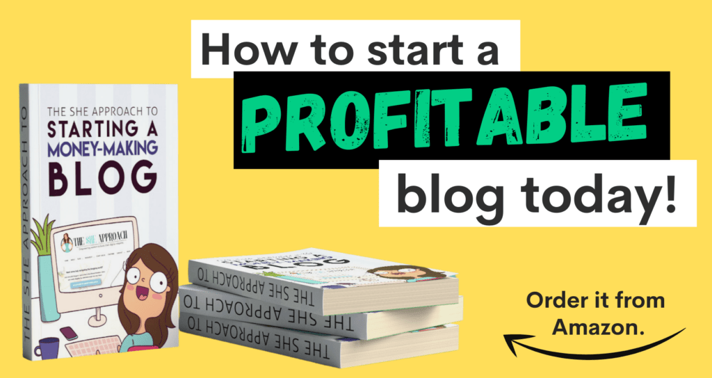
For even more guidance, you can grab my Amazon best-selling book on starting a money-making blog, filled with actionable tips, strategies, and real-world advice to help you get started on the right foot.
Don’t wait for the “perfect time” to start—start today, and take the first step toward building the blog and life you’ve been dreaming of!
Thoughtful Tweaks, Big Returns
Blogging is all about the long game. By addressing these mistakes, you’ll see your blog’s performance dramatically improve while also creating a fantastic experience for your readers.
Have you made any of these mistakes before? Don’t worry—we’ve all been there! If you’re just getting started, or need professional feedback on improving your blog, join our free blogging community or explore our beginner-friendly resources to set yourself up for success.
Start fixing, keep growing, and watch your blog thrive!
More Blogging Tutorials & Resources To Check Out Next:
- From Zero To Superhero: Affiliate Marketing Training Bundle For Beginners
- The She Approach To Making Your First 3 Amazon Affiliate Sales
- The She Approach To Boosting Your Blog Traffic
- What Is Hosting And Why Do Bloggers Need It
- How To Come Up With A Blog Name
- 7 Things I Wish I Knew Before I Started Blogging
- 10 Easy Steps To Writing And Publishing Your First Blog Post